

What is Customer Perception?
Customer Perception is what your customers think and how they feel about your brand and your company. It is not just about whether they like or dislike a brand, it is a much broader term. Customer Perception includes the way people would talk about your brand, the feeling your brand would give off, the way your brand would differentiate from your competitors (both verbal and visual communication), and, most importantly, how would your brand earn trust.
To generate a positive image, companies should work on many factors that directly influence such good impressions. Although there are lots of influential aspects to one’s brand perception, one of them stands out as a key to great brand identity – Color Psychology. Keep in mind, that this article is no designer’s guide, it is an orientation blog post that should help business owners and marketers choose or manage good graphic designers that would fit one’s brand. So, what colors mean in marketing?
Psychology of Color in Marketing
Color Psychology is one important fact that some marketing managers wrongfully leave out. Color Psychology has a big influence on customer perception and even the decision-making process. Let us get all this straightened out.
Сolor Perception Theory
Color plays an important role in our lives. Historically speaking, our eyes evolved in a way to deduce what food could be poisonous, or what should alert us of the upcoming danger. Such perceptive development paved the way for future generations to use colors in order to influence decisions regarding the product, company, and design.
But before digging into the perception of colors, let’s establish what color actually is. Colors seem to be of the most simple and fundamental things in the minds of those who are able to see them. Nevertheless, not many people can actually explain what a color is. So let’s fill this knowledge gap.
In fact, color is the property of what we see when our eyes interact with light and other objects. We see colors when light hits an object and is either absorbed or reflected back to us. Color is a reflected light wave from the object. White is the simplest form of color because it is a combination of all wavelengths that are reflected back to our eyes (because they aren’t absorbed by certain objects). Black color is a real color of all that we see, as we see black when all wavelengths are absorbed by the object.
The other colors (like pink, green, red) we can see when an object absorbs all other colors except this one. For example, we see red if the object has absorbed all colors except red, we see pink when pink isn’t absorbed, and so on. Moreover, every color has a different wavelength and frequency. Red color has the longest wavelengths with the smallest frequency, while violet has the shortest wavelengths with the biggest frequency. You can see the wavelengths and frequency of the seven main colors in the picture below:

Color Terminology
When we talk about colors, we tend to discuss the primary hues: red, green, blue, yellow, violet, and so on. But every color has many variations that would be influenced by its properties: how light or dark it is, how intense or disaturated it is. By understanding the basic terms of color properties, we can get an insight into the full-color spectrum.
That is why we want to familiarize you with some of the main essential terms in color psychology before starting to explore the meaning of colors.
Hue – is a color in its simplest form – pink, red, green, etc. (in design and in print it describes color without any added values, just reflected light wave); There are hundreds of individual hues to choose from when working in design.
Hue Circle/ Color Wheel

Hue Circle/ Color Wheel
Saturation – is intensity or chroma of a color;
Value – the lightness or darkness of a color in print and painting, this is controlled by adding more or less black, grey, or white colors to the additional color and therefore we have three more terms:
- Tint – is a value of color when we add white and our certain color become lighter;
- Tone – is a value of color when we add grey to a certain color;
- Shade – is a value of color when we add black.
Contrast – the difference in hues, saturations, and values between two or more colors.
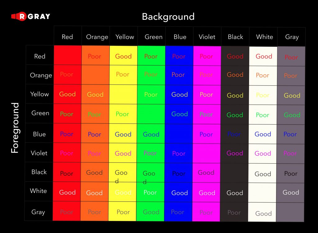
Providing high contrast in a design can help make the elements stand out. Low contrast can help elements blend more. One of the mistakes in design on a constant basis is when a low contrast is used for design. Sometimes you may want less contrast for stylistic choice, but keep in mind when designing that the most important information needs higher contrast for being visible, and easy to read.
Tips on How to Contrast Background from Foreground in Web Design
Those are the basic terms that help us to define colors, but that will be enough if you aren’t a designer.
Mood Ring Colors
Our perception of colors is based on our association, the major parts of which are embedded in our biological code. That’s why physiology of color researchers, designers, and brand managers use this knowledge to establish the best customer perception. So let’s see how we perceive the main colors of the spectrum.
The red color is associated with energy, alertness, love, blood, health, or food.

The orange color is associated with excitement, art, and food. Within the food industry, it usually represents the ingredients or flavor.

The yellow color is associated with happiness, stimulation, warmth and cheerfulness, and attention.

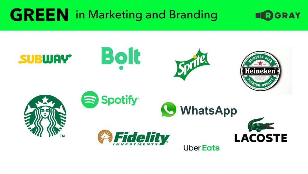
The green color is associated with health, calmness, money, and the Earth.
The blue color is associated with trust, loyalty, security, cleanliness, or purity. It is also associated with water.

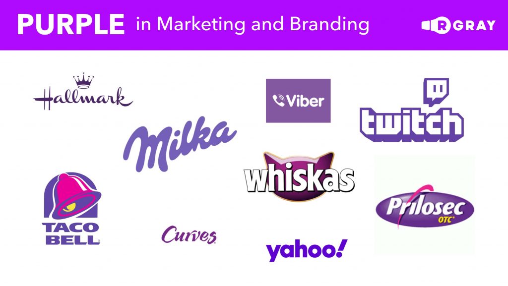
The purple color is associated with wealth, pride, royalty, fantasy, femininity, and luxury.
The brown color is associated with reliability, honesty, and natural products.

The grey is associated with neutrality, communication, security, and composure.

Black is associated with power, discipline, rebelliousness, luxury, and elegance.

The white color is associated with purity, cleanliness, and light.
By knowing how colors are perceived and combining them you are able to communicate a specific message to your audience just by using colors.
You may also see and separate the pictures with warm and cold colors. How? This also comes from physiology and physiological simulation. Colors like red, orange and yellow resemble fire or heat. The colors like green, blue, and violet usually remind us of being cool and cold. Using similar colors of both warm and cool together in your design can create a uniform look of colors that go well with each other. This is called color harmony because there is a niche balance of the color being chosen.
Conclusion
Use your newly obtained knowledge of color psychology and master managing your customer perception. Choose the perfect match of color to communicate the right feelings to your user. Play with saturation, contrast, value, and change the customer perception in the way you want. Choose the designer who will understand color psychology, upgrade your visual communication, and make it user-friendly and relative to your brand. But if you don’t have any designer to turn to, consider getting in touch with us, we know how to take your visual communication to the top.